Etihad Airways revealed its new livery on its first Airbus A380 and Boeing 787 in recent days, and will roll it out across its entire fleet. But not all airline rebrands go so well. We look at 10 of the worst paint jobs in airline history.
1. British Airways ethnic tailfins
In the 1990s, BA’s then-chief executive Bob Ayling oversaw a corporate rebrand that saw the flag carrier’s traditional logo replaced with so-called ethnic tails. It was meant to reflect BA’s status as a world airline and the new relaxed, multicultural Cool Britannia. However, the design was widely derided in the UK – most notably by former prime minister Margaret Thatcher, who placed her handkerchief over a model on a BA sponsor stand at the Conservative Party conference in 1997. The rebrand is said to have contributed to Ayling eventually losing his job.
2. Anka Air
If you write your name on the side of your aircraft as Ankair, best not to have an icon alongside it that looks like a W, even if it doesn’t come before the name. It hasn’t stopped Photoshoppers altering the Turkish airline’s logo and posting the resulting picture on web forums.
3. Air Jamaica
We certainly see what message the Caribbean carrier is trying to get across with its multicoloured concoction. Best not viewed when you’ve been on the Jamaican rum the previous night.
4. Austrian Airlines
When Austrian Airlines decided to adorn an aircraft with portraits of the country’s most famous citizens, like Mozart and Strauss, there was one notable exception. Actually, there were two. World champion racing driver Niki Lauda was also ignored because he was then running a rival airline. Nice idea, but asking for trouble.
5. BMI Baby
British Midland International – or BMI – launched its low-cost subsidiary in 2002 with a cringeworthy play on words and a scrawl of a livery, with the tail featuring what looked like a child’s crayon drawing of a child’s face. The livery, like the Boeing 737 operator itself, died when British Airways parent IAG took it over in 2012.
6. Kulula
The South African low-cost airline’s Boeing 737s are famous for their wacky green designs, but they are not to everyone’s taste. This one looks like a graffiti artist has been given free rein with the spray-paint.
7. Delta Air Lines
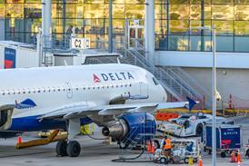
The US carrier’s new “colours in motion” livery for the 21st century, with a “flowing fabric” design on the tail, was known as “wavy gravy” and was disliked rather than despised. It stuck around until 2007 – mainly because Delta was broke – but not all its fleet aircraft were repainted, a sure sign that the marketing department’s enthusiasm for the rebrand was perhaps not shared throughout the company.
8. Braniff
Okay, it was the 1970s, but Braniff was the airline that taste forgot when it came to its liveries, often a seemingly random mix of reds, yellows, oranges and golds, which reflected the Texan carrier’s brash approach to business – at the end of the 1970s, it briefly operated Concorde domestically in the USA between Washington DC and Dallas Fort Worth on behalf of British Airways and Air France. Braniff collapsed in 1982.
9. Eva Air
Hello Kitty is an icon in Asia, and not just with children, so when Taiwanese airline EVA Air painted the Japanese cartoon character on five of its Airbus A330s, it seemed like a sound marketing ploy. And so it has proved. The character now adorns a Boeing 777-300ER which will fly between Taipei and Paris from 29 October, and the airline says demand for these flights is high. So, sorry EVA and Hello Kitty fans everywhere, but we just had to include it.
10. S7
You are not going to miss an Airbus A320 belonging to the Oneworld airline coming down the tarmac. But the Russian carrier’s lime-green colours are certainly an acquired taste.
Source: FlightGlobal.com